
Solar Cell Stability Data Visualization in Telegram
25 Jan 2026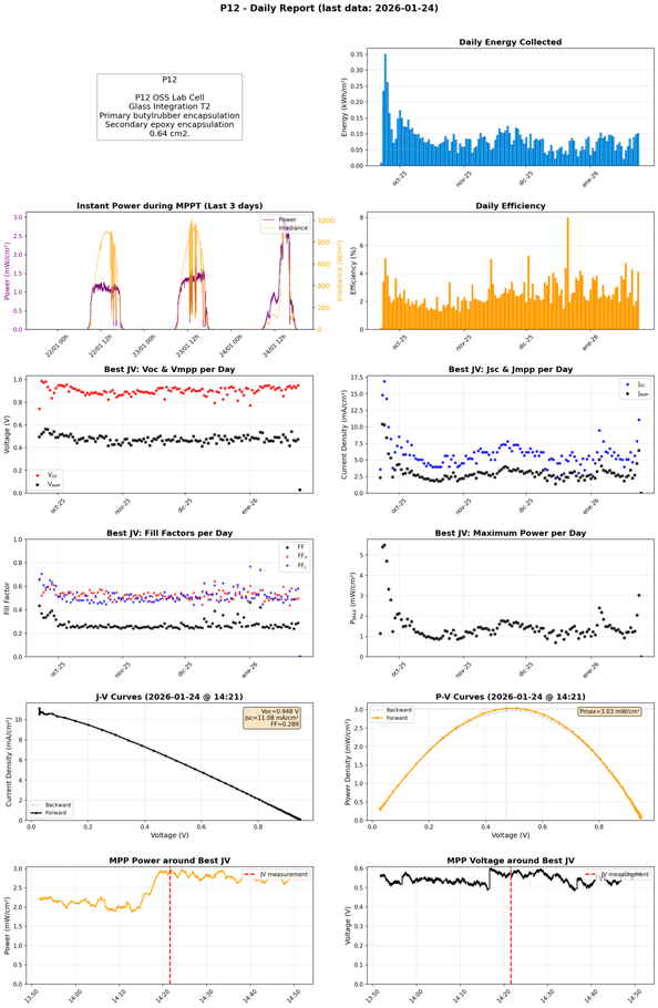 Figure: The new data panel
Rethinking Solar Cell Stability Data Visualization: From Real-Time Noise to Long-Term Insight
We have been monitoring perovskite solar cells outdoors with the ParaSol platform for over three years now. During this time, the reporting system has evolved according to day-to-day needs. What started as an hourly real-time diagnostic tool has transformed into a system oriented towards long-term trend analysis. In this post, I describe the most relevant changes in how we now present the data in our Telegram channel.
Reporting Frequency: From Hourly During Daylight to a Single Daily Figure
The most significant change affects how often reports are generated. Until now, the system produced an updated graph for each cell every hour, from 8:00 AM to 10:00 PM. This meant 14 daily reports per device, which made sense during the setup and debugging phases when we needed to detect problems in near real-time from a mobile phone without being directly plugged into the raw data stream (6–7 data rows per second per device) on a computer terminal.
However, once the system runs reliably, this frequency becomes excessive. It generates an amount of data that is difficult to review and consumes processing resources unnecessarily. From now on, a single daily report is generated around 9:00 AM, summarizing all activity from the previous day. This approach is much more manageable for long-term monitoring and allows more attention to be devoted to each report instead of getting lost among dozens of nearly identical graphs.
Panel 2: Instant Power with Context
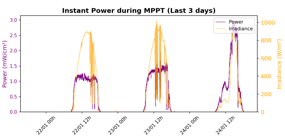 Figure: The new data panel 2
Previously, the instant power graph showed all data from the last 3 days without distinction. This included both periods in MPPT mode (maximum power point tracking) and moments when the tracker performed JV sweeps to characterize the cell. The result was a confusing mix where the peaks and valleys from JV sweeps contaminated the visualization of actual performance.
The new version filters exclusively the data corresponding to MPPT mode and, additionally, overlays the solar irradiance measured by the reference detector (a single Si solar cell monitoring short-circuit current and a commercial pyranometer—more on this in a future post). This makes it straightforward to correlate power drops with passing clouds or compare performance between days with different illumination levels.
Panels 4, 5, 6, and 7: JV Parameters Without Noise
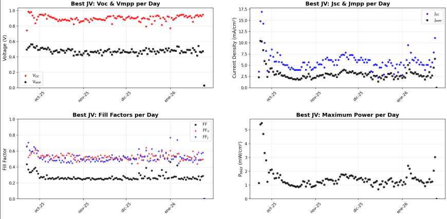 Figure: The new 4–7 data panels
In the early days of ParaSol, we only showed panels 0–3, excluding any reference to JV sweeps performed between MPPT modes. However, this summer, at the request of our colleagues from EnergyVille (Belgium), who kindly provided two large perovskite modules, we began reporting this data.
The characteristic parameters of JV curves (open-circuit voltage, currents, fill factors, and maximum power) are fundamental for evaluating the state of a solar cell. In the previous version, these parameters were extracted from each measured JV curve and represented as continuous time series.
The problem is that, as weeks or months of data accumulate, these graphs become unreadable. The natural dispersion between measurements, variations due to temperature and irradiance, and the simple fact of having hundreds or thousands of points generate noise that completely obscures the degradation or stability trends we actually care about.
The solution has been to select only the best JV curve of each day, with “best” defined as the one delivering the highest power. This reduces each time series to one point per day, drastically cleaning up the noise and revealing the underlying trends. It is now possible to see at a glance whether Voc, Vmpp, Jsc, or Jmpp is gradually declining, or if the fill factor remains stable after months of exposure.
Panels 8 and 9: Visible Hysteresis
 Figure: The new 8 and 9 data panels
Perovskite cells exhibit hysteresis: the JV curve measured sweeping from low to high voltage (forward) does not match the one measured in the opposite direction (backward). This phenomenon, related to ion migration in the material and charge-selective contacts interfacing the perovskite, is one of the most studied characteristics of this technology.
In the previous system, both sweeps were processed together as if they were a single curve. When sorting the points by voltage for plotting, the result was a zigzag pattern that did not correspond to any real physical curve and made interpretation difficult.
Now the system correctly identifies and separates both sweeps. In the J–V and P–V curve graphs, the most efficient curve (typically backward in perovskites, but not always, as hysteresis can decrease or be mitigated over time) appears as a solid line, while its companion is shown as a faint dashed line. This allows direct visualization of the hysteresis magnitude and how it evolves with time or measurement conditions.
Panels 10 and 11: Temporal Context of the Best JV
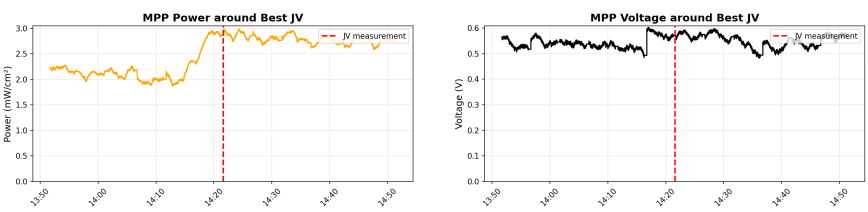 Figure: The new 10 and 11 data panels
The last two panels now show something that was not previously available: the cell’s behavior in the minutes immediately before and after the best JV measurement of the day.
Why is this useful? Because it allows evaluation of whether the cell was operating stably when the JV sweep was performed or if, on the contrary, it was in a transient state. It also shows how the cell responds after the sweep: whether it immediately recovers its previous operating point or takes time to stabilize. This type of information is relevant for understanding hysteresis and degradation mechanisms under real operating conditions.
If you’re interested in following our perovskite stability experiments in real time, feel free to join our Telegram channel. We share daily updates on device performance, new measurement features, and occasional insights from our outdoor testing campaigns. And if you know colleagues working on perovskite stability or outdoor photovoltaic monitoring, we’d appreciate it if you spread the word—the more eyes on the data, the better the science!